

Webflow website design is a visual development approach that helps teams build and maintain responsive marketing websites with consistent layout control, a structured CMS, and production-ready front-end output.
I have reviewed a lot of Webflow and non-Webflow marketing sites, and speed shows up as a repeat UX problem. Google research shows that 53% of mobile visitors leave a page that takes longer than 3 seconds to load, so performance is not a nice-to-have for UX.
In this guide, I will break down 10 practical Webflow website design benefits tied to user experience outcomes, plus how to apply each one on real marketing pages in a way that stays measurable and maintainable.
What is a better user experience for a Webflow marketing website?
- Visitors understand what you do, who it is for, and what to do next within seconds, without hunting for context.
- Pages load quickly and stay stable on mobile, so scrolling, reading, and tapping feel smooth with no layout shifts.
- Navigation feels predictable and intentional, and key pages like pricing, services, and contact are reachable in 1 to 2 clicks.
- Content is easy to scan on every breakpoint, with clear headings, short sections, and spacing that keeps the page readable.
- Forms and calls to action feel low-friction, with clear labels, helpful errors, and focus states that work for accessibility.
Why is Webflow built for UX-focused websites?
Webflow is built for UX-focused websites because it gives teams direct control over responsive layout, spacing, typography, and interaction states, without depending on a large plugin stack for basic behavior. Webflow also generates semantic, standards-aligned output that supports cleaner structure and accessibility when the site is built with discipline.
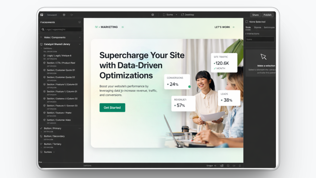
Webflow also supports long-term UX because teams can standardize components, structure content in the CMS, and ship improvements faster without rewriting templates. Webflow components are designed to let you update recurring blocks in one place, which reduces inconsistency as the site grows.
What are the user experience benefits of Webflow website design?
Webflow helps teams build marketing websites that feel clear, fast, and consistent across devices. At Devziv, we focus on these UX outcomes because they reduce friction, build trust, and move visitors to the next step.
- Mobile-first responsive control
- Consistent design system across pages
- Faster page speed and smoother performance foundations
- Cleaner navigation and site structure
- Structured CMS for predictable content layouts
- Reusable components for consistency at scale
- Accessibility-friendly build habits and cleaner semantics
- Purposeful interactions that guide users
- Better content updates without layout breakage
- Stronger landing pages for conversion-focused UX
1. Mobile-first responsive control

Webflow gives you direct control over how layouts adapt across screen sizes, so your pages stay readable and usable on phones, tablets, and desktops. That control helps you prevent common mobile UX issues like stacked elements colliding, buttons becoming hard to tap, or text shrinking into cramped lines. Visitors get a page that feels designed for their device, not forced into a smaller frame.
Responsive UX improves when spacing, hierarchy, and tap targets stay consistent at every breakpoint. With Webflow, you can refine typography, spacing, and layout rules per screen size while keeping the same design system intact. For example, a pricing section can keep plan cards aligned and easy to compare on mobile instead of collapsing into a confusing wall of text.
How we apply this in Webflow
We review each key section at every breakpoint, set consistent spacing rules, and test buttons and menus with thumb-friendly tap targets.
2. Consistent design system across pages
A strong user experience depends on consistency across every page a visitor touches. When headings, buttons, spacing, and section patterns look and behave the same, users move faster because they know what to expect. That reduces cognitive load and makes the site feel easier, even before the visitor reads the content.
Consistency also protects trust because visual mismatch creates doubt. If one page feels polished and another feels improvised, visitors hesitate and the journey slows down. For example, a consistent button style across home, pricing, and contact pages helps users recognize the next step instantly without second-guessing.
How we apply this in Webflow
We define core styles for type, buttons, and spacing, then reuse classes and components instead of restyling the same elements on every page.
3. Faster page speed and smoother performance foundations
Speed is part of user experience because it shapes first impressions and patience. A slow page creates friction before the visitor understands your offer, which can increase drop-off and reduce trust. Webflow can support a cleaner performance baseline by reducing tool sprawl and keeping site building, content, and publishing in one workflow.
Performance also improves when teams avoid stacking heavy scripts and conflicting add-ons. A controlled Webflow build makes it easier to maintain page quality over time because fewer moving parts mean fewer surprises. For example, a landing page with lightweight visuals and limited third-party scripts will feel more responsive during scroll and form interactions.
How we apply this in Webflow
We compress images, keep animations lightweight, and audit third-party scripts so only tools that support the user journey remain.
4. Cleaner navigation and site structure
Better UX means visitors can find key information without effort. Clear navigation reduces confusion and helps users reach pricing, services, or contact details quickly, which keeps momentum high. Webflow makes it easier to design navigation that stays consistent across pages, so users do not have to relearn the interface.
Structure matters even more as a site grows and content expands. When menus become crowded or page hierarchy becomes unclear, visitors hit dead ends or loop between pages. For example, a simple “Services” dropdown with clear labels can prevent visitors from bouncing because they cannot find the right solution.
How we apply this in Webflow
We keep primary navigation short, use specific labels, and organize pages around user tasks rather than internal team structure.
5. Structured CMS for predictable content layouts
A CMS improves UX when content follows a predictable, scannable pattern. Webflow CMS lets you define fields and templates so blog posts, case studies, and resources share the same structure every time. This helps visitors scan faster because headings, sections, and key details appear where they expect them.
Structured content also reduces publishing errors that damage readability. When authors fill defined fields instead of pasting content into inconsistent layouts, the design stays stable and easier to skim. For example, a case study template that always includes the challenge, solution, and results makes comparison effortless across multiple stories.
How we apply this in Webflow
We build CMS templates with clear sections and enforce content rules through CMS fields so every new item publishes in a consistent format.
6. Reusable components for consistency at scale
Reusable components improve UX by reducing unnecessary variation across pages. When common sections repeat in familiar ways, visitors spend less effort learning the layout and more time understanding the message. Familiarity lowers friction, which helps users move confidently from one page to the next.
Components also help teams ship faster without sacrificing quality. Instead of rebuilding the same testimonial block, feature grid, or CTA section, you reuse approved patterns that already work. For example, reusing one proven CTA block across service pages keeps the next step consistent and reduces decision fatigue.
How we apply this in Webflow
We turn high-use sections into reusable components and treat them as the single source of truth for layout, spacing, and copy structure.
7. Accessibility-friendly build habits and cleaner semantics
Accessibility supports better UX for more users, including people using keyboards, screen readers, or higher contrast settings. Clear heading structure, labeled form fields, and visible focus states reduce confusion and make tasks easier to complete. A site that is easier to use for more people is also easier to trust.
Accessibility also prevents hidden friction that hurts conversions. Missing labels, unclear error messages, and poor contrast can stop users right before the final step. For example, a form with clear labels and helpful validation messaging can reduce abandonment and support successful submissions.
How we apply this in Webflow
We follow proper heading order, label every form field, confirm contrast, and test keyboard navigation on the highest-traffic pages.
8. Purposeful interactions that guide users
Interactions improve UX when they provide clarity and feedback, not decoration. Hover and focus states help users understand what is clickable, while subtle transitions can confirm that an action happened. Webflow supports visual interactions so teams can add guidance cues without relying on complex custom code.
Too much motion can hurt UX by distracting users and slowing comprehension. The goal is to reduce uncertainty, not add noise. For example, a subtle state change on a primary button can increase confidence, while a heavy animation on every scroll can make the page feel tiring and slow.
How we apply this in Webflow
We use interactions only where they clarify next steps or confirm actions, keep motion subtle, and validate usability on mobile devices.
9. Better content updates without layout breakage
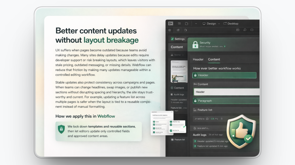
UX suffers when pages become outdated because teams avoid making changes. Many sites delay updates because edits require developer support or risk breaking layouts, which leaves visitors with stale pricing, outdated messaging, or missing details. Webflow can reduce that friction by making many updates manageable within a controlled editing workflow.
Stable updates also protect consistency across campaigns and pages. When teams can change headlines, swap images, or publish new sections without disrupting spacing and hierarchy, the site stays trustworthy and current. For example, updating a feature list across multiple pages is safer when the layout is tied to a reusable component instead of manual formatting.
How we apply this in Webflow
We lock down templates and reusable sections, then let editors update only controlled fields and approved content areas.
10. Stronger landing pages for conversion-focused UX
Landing page UX is about focus, clarity, and momentum. Visitors should see one primary offer, proof that supports it, and a clear next step without distractions. Webflow supports fast page creation and iteration so teams can refine structure and messaging while keeping the design system consistent.
Conversion-focused UX improves when friction is removed from the path. Scannable benefits, clear sections, and simple forms help users complete actions without hesitation. For example, a landing page with one primary CTA and a short form can feel easier to finish than a page with multiple competing buttons and long inputs.
How we apply this in Webflow
We use a repeatable landing page layout, keep one primary CTA above the fold, and reduce form fields to only what is necessary for the next step.
When Webflow is the right choice and when it is not
Webflow is a strong fit for teams that want a marketing website that stays clear, consistent, and easy to improve over time. It is not the best fit for every build, especially when your project needs complex application logic or advanced back-end systems.
When Webflow is the right choice
- You need a marketing website for SaaS, B2B, or services where clarity, trust, and conversion flow matter.
- Your team publishes landing pages, case studies, and blog content often and needs updates without layout breakage.
- You want a consistent design system across pages so the site feels cohesive as it scales.
- You want structured CMS templates so content stays predictable and easy to scan.
- You want one workflow for design, content, and publishing to reduce Webflow maintenance overhead.
When Webflow is not the right choice
- You are building a complex web application with advanced permissions, heavy back-end logic, or custom workflows.
- You need deep database-driven functionality that depends on a traditional engineering stack.
- Your project depends on a large plugin marketplace for niche features that require extensive third-party extensions.
- Your team cannot follow design and content rules consistently, which can cause pages to drift over time.
- You need the lowest up-front build cost and are willing to trade off long-term maintainability and UX quality.
Webflow UX builds delivered by Devziv
Devziv is a Webflow-focused development agency that builds responsive, production-ready websites with clean structure and stable layouts. Typical work includes Webflow page builds, CMS setup, mobile fixes, and ongoing site updates, with an emphasis on keeping the website organized and easy to manage as new pages are added.
If you need a new Webflow website, a redesign, or a migration, Devziv can deliver it as a fixed project. If you need continuous Webflow support, Devziv also offers ongoing help through a subscription or monthly retainer, and can support agencies as a white-label Webflow partner for builds, CMS work, and updates under the agency name.
FAQs
1. Is Webflow good for user experience?
Yes, for most marketing websites. Webflow helps teams keep layouts consistent, pages easy to scan, and mobile experiences clean, which reduces confusion and friction.
2. Is Webflow good for mobile websites?
Yes. You can control how sections stack, how text scales, and how buttons behave on smaller screens, so mobile visitors do not struggle to read or tap.
3. Can I update a Webflow site without a developer?
In many cases, yes. If the site uses a structured CMS and reusable sections, you can update text, images, and pages without changing the underlying layout.
4. Is Webflow SEO friendly?
It can be, when configured well. Webflow lets you manage page titles, meta descriptions, redirects, and structured page layouts, which supports search visibility for marketing pages.
5. When should I choose Webflow over WordPress?
Choose Webflow when you want more design control and fewer plugin dependencies. It is a strong option when consistency and maintainability matter more than access to a large plugin marketplace.
6. What are the downsides of Webflow?
Webflow is not ideal for complex web applications with advanced permissions or heavy back-end logic. Some specialized features may require custom development or integrations.
7. How much does a Webflow website cost?
Pricing depends on scope, not a single number. Cost changes based on page count, design depth, CMS setup, integrations, and whether you need migration or ongoing optimization.
8. Is Webflow good for landing pages?
Yes. Webflow is a good fit for landing pages because you can build focused layouts, reuse proven blocks, and make updates quickly without redesigning the entire page.


